Max Strangeness
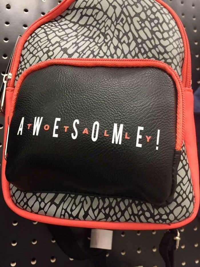
Sometimes, the idea is clear, but it’s overshadowed by foolishness and clumsiness in execution. This backpack isn’t terrible, but it’s on our list for a reason. Let’s break it down.

The color combination is great, and the font isn’t too basic. However, they made a mistake putting the letters so close together and in the same font. It looks like “atwoetsaolmley” instead of “totally awesome.” It’s not awesome; please fix it!
